
In the earlier post, we talked about the difficulty of scaling Uis across the current PPI range we have on the mobile and embedded space. We also hinted that the most common way to avoid this problem was done via providing several image assets that help to mitigate this issues.
How does it work? How can one carry out it in QML? And more importantly where does it fail? Were it’s the best solution and what trade offs does it involve?
Icons.
Icons are probably the easiest place to start here, long before the mobile became what it is, we were scaling icons, very much in the same way we are doing those very same icons for mobile today.
Icons depending on the platform were done in 2x multiples of 16 and a size in between. So 16×16, 24×24, 32×32, 48×48, 64×64, 96×96, 128×128,172×172, 256×256, 512×152… The reasons for all these sizes are multiple and range from marketing, specific use, type, clickable area and visibility. But you might ask how come so many and how come we don’t just use one size and scale it?
To answer that question we first need to understand the Pixel and how scaling works.
What is a Pixel?
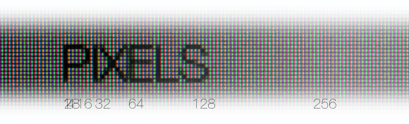
A pixel is a color composed of smaller colors, it’s the almost indivisible element, its shape depends on the technology used by the screen, but for simplicity’s sake we use the “mostly” square element made by the RGB strips on an LCD screen. We use this pixel because 1) it maps really well to image pixels, and 2) it’s the most common technology used in displays.
How does scale work?
Scaling can be done via multiple smart or not so smart algorithms but usually is the result of some interpolation of pixels in a new rendering grid. The result is that when a pixel is stretched it is distributed across the new pixel grid.
Something about icons.
Icons are special images that use the pixel grid to their full potential. In icons we still paint in pixels even if they are done in a vector drawing application. We still align our vectors to a virtual rendering grid, we do this to maximize contrasts and sharpness, and as a result icons tend to make a lot of use of perpendicular and horizontal contrasts.
Scaling an icon results in blurry images, as those pixel contrasts get blurred on the interpolating process and only work on multiple values if the contrast lines were done on the major 16×16 grid lines. Even there we lose meaningful data as a contrast that was 1 pixel wide becomes sub-pixel 0.5 or 0.25.
For this reason, when we do iconography, each icon is redone for every size, and we NEVER scale icons from one size to another…
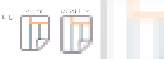
As you can see in the image, scaling an icon by just 1 pixel can result in very blurry results. My advice is that if you need icons in different sizes that look the same in different pixels per inch, you should provide multiple images using 2x and one in between scale factors with the icon redone to take advantage of the extra pixels.
What Android expects for icons
Again using android as our example platform
“to create an icon for different densities, you should follow the 2:3:4:6:8 scaling ratio between the five primary densities (medium, high, x-high, xx-high, and xxx-high respectively). For example, consider that the size for a launcher icon is specified to be 48×48 dp. This means the baseline (MDPI) asset is 48×48 px, and the high density (HDPI) asset should be 1.5x the baseline at 72×72 px, and the x-high density (XHDPI) asset should be 2x the baseline at 96×96 px, and so on.”
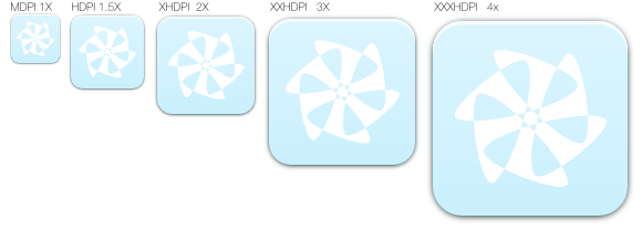 notice that each icon was slight altered to take advantage of the extra pixels while maintaining the same look overall.
Buttons and other X/Y independent scalable elements
What about UI elements that are supposed to scale in an X/Y independent fashion, like Buttons, GroupBoxes and other custom image-based elements. How do they work?
In QML we have a Component that was made with these sort of elements in mind, the BorderIMage, it expect an image that it can slice in 9 bits so it can scale/tile each one in an appropriate way. example code..
BorderImage {
   id: scalableElement
   source: "./image/Imagebase.png"
   width: 100; height: 100
   border.left: 25; border.top: 25
   border.right: 25; border.bottom: 25
  }
The code above creates an element with 100 by 100 pixels using unscaled corners with 25×25 pixels from Imagebase.png wile stretching the areas in between those 25 pixel segments.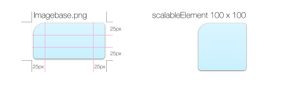
Now for the main question? How big should it be? And in what metric?
If it’s used on a touch screen then it should be big enough for you to touch it without triggering false hits or miss hits, and big enough is something between 7 and 9 mm depending also on how tolerable a missed hit can be for the user. This number is roughly speaking the size of your thumb contact surface with a touch screen.
This means that we have two conflicting metrics here, on one end we have the pixel, on the other physical size, we still express values to the QML code in pixels and yet we need to make this elements as big as my thumb.
PPI or DPI
PPI or DPI are the amount of pixels in an inch of your screen, you can expose the PPI to QML via several methods, but we want the real PPI not the logical one. If you are “pixel crazy” like me, you will want the PPIx and PPIy – yes the pixels are not always really “square” and you might want them both.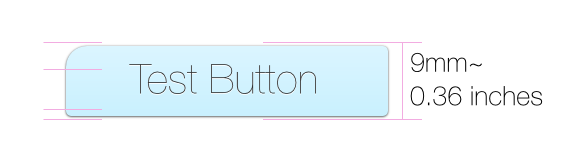
To create the button above this code should in theory be enough:
....
property int dpi: Screen.pixelDensity*25.4
....
BorderImage {
   id: scalableElement2
   source: "./image/Imagebase.png"
   width: 1.5*dpi; height: 0.36*dpi
   border.left: 25; border.top: 25
   border.right: 25; border.bottom: 25
  }
This code exposes the usual method we will use the most, ppi or dpi as the main metric. it creates a button 1.5 inches long by 0.36 inches tall no mater what screen you use. However it still is not looking the same across multiple screens the curvatures on the corners will decrease as the PPI grows and the drop-shadow will become increasingly invisible. So one needs to introduce a similar solution that we created for the icons, were we use multiple baseImages for multiple PPI ranges. In my next blog post I will try to show how it can be done in an hopefully not too “ugly” way. We will also discuss the limitations of this method…