
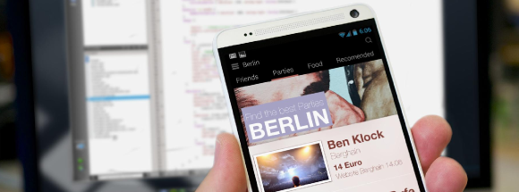
In the previous blog post, we talked about the importance of pixels and their indivisible nature, the way we deal with that in the icon area and introduced the concept of PPI dependable UIs – all this to have truly scalable graphics in QML.
We used the BorderImage element to illustrate how an element could scale and retain the same aspect ratio across a range of different screen PPIs and their corresponding screen definitions.
BorderImage is for Scaling!
When I first got into Qt Quick and QML, the one element that made me instantly fall in love with the entire thing was the BorderImage element. It made things that were complicated instantly trivial, plus it saved me, the designer, the tedious trouble of pre-slicing images into 9 rectangular elements, which dramatically helped with the “deliverables” problem and with small adjustments. Even today, with all of the new things we have like the Canvas or Shaders, BorderImage remains my favourite element in QML.
However that might not be enough (and it really is not enough). To expose what goes on when ppi changes, I created a video on a hypothetical screen. Using similar code to that shown in the last post: a BorderImage component that lived inside an element whose pixel count grew, and which then, when scaled back into the original size, mimicked the scaled appearance of a flexible dpi count screen…
Here is the code that generates that central blue element:
.......
 BorderImage {
   id: scalableElement2
   source: "./Images/baseBImage.png"
   width: parent.width-ppi/2
   height: ppi*1.5
   anchors.centerIn: parent
   border.left: 27; border.top: 27
   border.right: 16; border.bottom: 16
 }
.......
(notice it is obviously not pixel perfect as pixels are scaled)
output31 (click here if your browser does not want to show the video) output_file.webm
So as you can see the results are far from perfect. In spite of the created element retaining the desired overall size, its look radically changes as we grow the pixel count, the corner radius diminishes almost into nothing, and even the overly done drop shadow that is huge in 90dpi becomes almost invisible on an hypothetical 570 dpi screen.
An expected solution
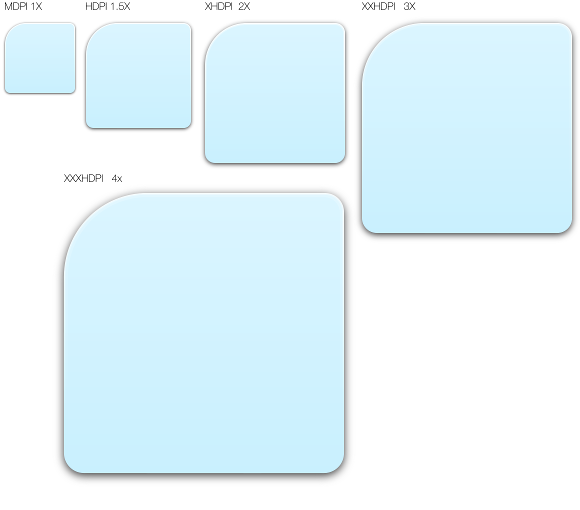
One possible solution, and the most commonly used, gets its inspiration from the way we scale icons, this means using multiple source Image files for ppi ranges.
And the way we generate those source images is again very similar to the way we generate them for icons. Using a vector drawing program, we scale the source image into multiple scale size elements and render those into raster images, png’s, jpeg’s, etc.
 We can also define the sizes of the corners/borders in ppi/inches. As long as the ppi is larger than the number of pixels the corner has, we will be just extending the place where border line cuts the image. You just need to pay attention to leaving enough margin in those areas, so that no gradient/texture scaling problems might become too visible. Just keep in mind that the slicing lines of the border image will not be in a precisely defined position.
Showing the Code
What I will show now is just demo code. There are better ways to do it with components now offered in Qt to facilitate this, but here I am just trying to expose the logic and the problems, so I have opted for this simple method.
.......
property var dir: ["MDPI","HDPI","XHDPI","XXHDPI",
                                    "XXXHDPI","XXXXHDPI"]
readonly property int ppiRange:{
 if (ppi>=540)
  5
 else if (ppi>=360)
  4
 else if (ppi>=270)
  3
 else if (ppi>=180)
  2
 else if (ppi>=135)
  1
 else
  0
 }
.......
......
BorderImage {
   id: scalableElement3
   source: "./Images/" + dir[ppiRange] + "/image.png"
   width: parent.width-ppi/2
   height: ppi*1.5
   anchors.centerIn: parent
   border.left: 0.3*ppi; border.top: 0.3*ppi
   border.right: 0.18*ppi; border.bottom: 0.18*ppi
 }
.......
What you can see here is a simple way to change the source directory, depending on the dpi and the the Border position cuts defined in inches via the ppi number… I generate all the images and place them in conveniently named directories that are mapped in our “dir” variant. This has proven to be a generally good idea in my experience when creating all of the assets; it makes it easy to compare directories and search for missing assets.
Again, here is a video showing how it all looks when we dynamically change the ppi. Remember once more that the real thing will look much better since it will not be scaling pixels – but it should give you an idea of how it works.
output32 (click here if your browser does not want to show the video) output32.webm
As you can see the results are much better now and the image retains its global appearance across the ppi range. There are still issues in the corners and shadow size, especially when reaching the 540 ppi area, and if you target a device that is only slightly below 540, you might want to create more assets for that segment. This is true for any case, the values I picked were somewhat arbitrary and a multiple of a 90 ppi theoretical screen. In real life you tend to target a specific set of devices and probably will want to use those as the ones that set your boundaries for the definition of your image assets. Just pay attention to where each range ends and another begins, and make sure you are not discarding important visual information.
In the next post we will discuss more exotic methods of scaling that might be useful, depending on what you want to scale. So, see you soon.