
A User Experience is not defined to exist in a single form factor any more.
It is expected that it can flow from one device to another seemingly adapting itself to each interaction paradigm, and yet to retain branding, mood and overall look and feel across multiple platforms.
On the other end, it’s expected that Designers and Developers create User Interface solutions that feel native across platforms and device types. At the same time a single platform can have a huge amount of variable interface possibilities that need to be taken into account by the UX/UI…
These are just a few problems one needs to take into account when designing apps for cross-platform deployments. At first sight it might seem like an impossible task to tackle.
In the next series of Posts I will share my experience in trying to square the circle, on what I have learned and how it can be implemented in QML…
Scalability.
Unfortunately there is no magic “design-once, deploy-everywhere” that can turn a windows 8 desktop application into an iOS touch app and also an embedded device UI. It’s not as simple as scaling an app from a 4 inch screen into a 27 inch one by stating the number of pixels in the x and y dimensions (these days it can be the same). Users have different interaction expectations on different devices.
Scaling the same application on the same platform
Let’s start with what could be considered at first sight the easiest task… Making one application for say a mobile platform, for the sake of example, let’s use Android…
So in theory and all things being perfect you would design/implement an UI and you would expect it to work across the entire platform, on all devices, and in a way it does. You can stick with using only simple QtQuick.Controls elements that look native and scale nicely already; but there is a problem here, the number of elements available is limited, and the designer in you wants to mimic a certain intellectual concept into a visual metaphor that helps the user to “learn” the intended UI, and for that you need to design your special ButtonFoo or SpinSliderMagic etc, etc…
This is where QML is perfect, it was designed exactly for this, an easy way to declare such custom components that can mimic so much better the intended user interaction paradigm.
You can think of it like this: you have to paint a landscape and you have to do it with just Lego, there will be a moment when you just need a “triangular” non-existing piece to make the whole thing perfect. Because it’s the “triangular” thing that you can share across multiple platforms and unites the entire application across the diverse platforms, or it’s the triangular piece that “just works” for the content/interaction space ratio, whatever the problems you may have, you will need many “triangles”. QML allows you to do just that.
The Problem
In the desktop world, most screens have, up until recently, rather similar ppi’s (pixels per inch)
and the differences were many times mitigated by the distance to the user eyes. Larger screens had smaller ppi’s but were further away from the user eyes. This meant that the fundamental metric to design anything was the PIXEL – the smallest almost indivisible element that you could use. Because of this fact, fonts that apparently used different metrics were in reality using pixels – the logical value for ppi was hard-coded in the several desktop OSs. To avoid that, the font size – widget size ratio would change from screen A to screen B.
All of this was only possible due to the fact the range in ppi’s was rather limited…
Now let’s take a look at ppi’s on Android devices. It is totally possible to enter a store and look at 2 devices that look similar with radically different ppi’s from the 90s ish (where you can clearly discern individual pixels), to the mind-blowing 500s where it’s much more than the human eye can tell apart.
Yet one expects that a given app looks similar enough on both devices.
Using the same approach to element creation that we have on desktop simply does not work here.
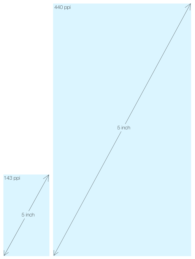
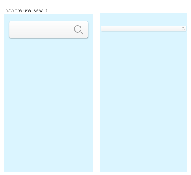
If one uses a simple QML file that tries to scale a button-like element to the 2 screens above using a BorderImage element and simply states the distances in pixels, it will result in severely different looking apps to the user.
There are multiple ways to solve this issue and it is my plan to talk about them in the following posts, as, in my opinion, different methods can be used depending on the specific problem. However, to do that we need to expose and understand those very same problems, both from a conceptual as well as from a rendering pixel point of view.
The Usual method
The most common way to solve this issue is via the shipment of several different source images that are targeted at ppi ranges combined with ppi range metrics.
How one can implement such solutions, in current QML? What are the limitations? Where does it work the best? All of this will be the subject of the next post.
So stay tuned as this might be a fairly lengthy subject…