In the beginning there was …
That’s how things start, right? And in the beginning there were punch cards. The UI was rudimentary direct machine language, so we could say there was no UI. So let there be light!
In very simplistic terms that was a screen where one could type text (using a keyboard) and see the same text on the screen … maybe get some feedback on the results of a command.
And let the animation begin! Probably the first animation (UX/UI) was the blinking cursor with a simple message: “You can enter text at this position”. It’s a surprisingly simple and effective animation that serves an extremely useful purpose, avoiding a great deal of UI components that would probably force you to look way from this internationally recognized symbol.
Animation has become critical in helping software communicate to users. It is everywhere due to its ability to inform in a natural way. In a modern UX, the lack of animation can make an interface seem outdated, uninspired, and more importantly, inefficient. In some ways you can think of animation as the soundtrack for a movie. Without the sound track, a movie would look austere and deprived of the tension clues that we take for granted. Many of the memorable scenes from our most loved movies would lose much of their drama. You wouldn’t think of making a movie without a soundtrack; so you shouldn’t design an app without thinking about the animation.
In this multi-part blog series, we’re going to explore not only what makes for good animation but also how to bend Qt to your will and implement some interesting, unique animations. We’ll be targeting both designers and programmers to help build a bridge between the two disciplines, hopefully with enough technical detail and example code so that you can bring these techniques into your software.
So! What makes for good animation?
These are my personal guidelines and, while some people may emphasize different aspects, most designers that work with animation will use a set of principles not so different to these.
Rule 0 – Animation should tell a story.
Animation is communication and that communication should be structured so that users can understand its central idea. No matter how simple or short the point you’re making, think of an animation as a mini movie with tension and release, a story arc and a conclusion. This will help ensure that each animation is engaging and serves a point. A button that “jumps” down and suddenly stops says nothing, while the same button sliding down and bouncing before settling can convey weight and importance.
Rule 1 – Animation should be believable.
Animation is feedback to users and helps explain the nature of objects in your program. It needs to be understandable, natural, and, most important perhaps, believable. Believability is achieved by being faithful to the concept you’re explaining. A bouncing ball should look like it obeys physics. If it doesn’t, it will look awkward and distract users from your point. You don’t want to make users work to figure out what an animation is, what it’s doing, or why it’s not quite right. That’s not to say you need to use a physics engine to achieve complete accuracy. You can pre-generate or “fake” the data feeding your animation as long as the end result looks believable.
Rule 2 – Animation shouldn’t be intrusive.
Some animation is really for branding, introduction, or distraction, and rule two doesn’t apply to those situations. Animation that slows down users without helping them should be avoided whenever possible and, like most advertising, will become an irritant if it can’t be skipped. (We’ve all seen examples of excessive, gratuitous, or intrusive UX animation that just irritates the user.) In the end, don’t forget the design mantra that “less is more”. But remember to balance it with the second mantra that “less is a bore”.
Rule 3 – Animation should connect you.
Humans are emotional beings. We want to have fun and animation is a great place to include what all humans crave. If there is one place were you can say to your user, “I care about you” it’s in animation, which can range from simple functional animation (the blinking cursor) to fun, silly, over-the-top transitions. This balancing act between the three previous rules and the desire to establish a fun, lovable, and memorable experience for the user will guide their perception of how much you want to make them love the experience.
What’s next?
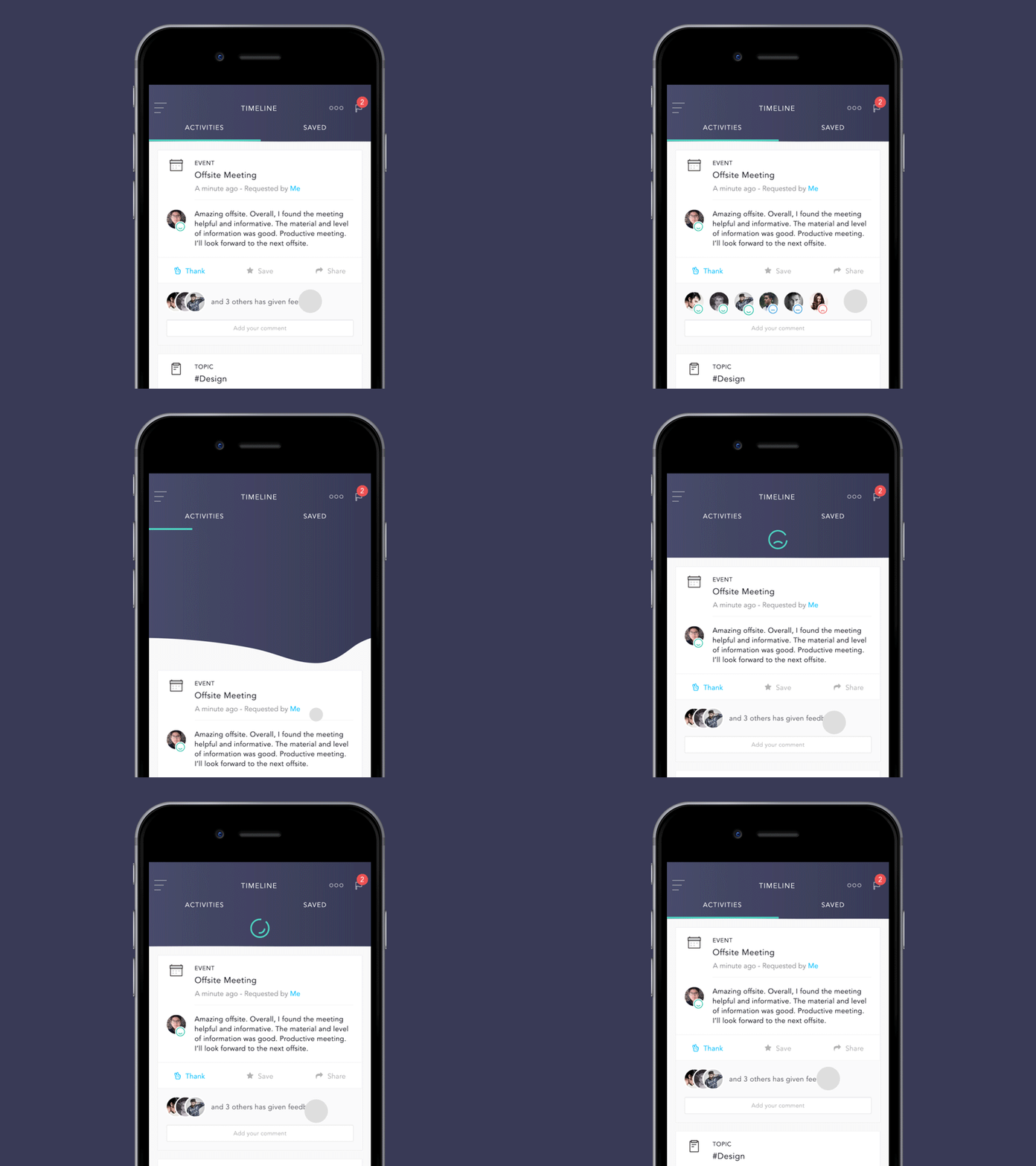
Here I covered the basics of what the fundamental principles to create good animation are. Used properly, animation can explain causality in your software, give your UX a bit of style and flair, and make a connection to your users. Stay tuned for follow-up blogs in this series where I’ll be delving into some advanced animation techniques with Qt specifics on how to create animations like the ones we show above and more, much more.
Next post will probably be about animation curves and making them bend to your absolute will in QML. Until then, cheers..
Oh… and, as usual, please add a comment below, for feedback on the subject or aspects you would like to see covered in this series.


