Moving away for my original plan, today we will be talking about Vectors.
To start this series of posts I had a main motivator, SVG. It is a great file format, its the file type I use day in day out and the format I use the most to create all of my images…
But every so often the question about scalable UI’s and Vectors pops up. And someone will say something like “we should just use vectors to scale things”. To that, I will usually say something like, “Scalable Vectors Graphics are scalable but your screen is not“, hoping it will close the conversation just there, and it usually does.
However the above statement is only partly correct and is not the definitive reason why we should avoid off-the-shelf vectors as the source image format for our UI assets.
Scalable definition is a bit like being “impassioned”.
The way we define “Scalable” UI’s, as we have seen in the past posts, is very peculiar and we tend to use it the way it suits us best, ignoring the practical differences between the different meanings of the concept. Ergo, like being impassioned, the target of our focus is more what we want it to be rather than what it really is.
This tends to produce the confusions and misunderstandings that are so common in this area, precisely because the Scalable part in SVG, is for a certain type of the referred concept, and most of the time not the type of scalable we need in UI.
So what does scalable mean for a Scalable Vector Graphic?
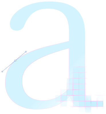
An SVG or any other main vector format is formed (mostly) of mathematical information about paths and its control points (Bézier curves), its visual size is only relevant in regards to the render size of the canvas it’s on, and as a result you can zoom an image almost infinitely and will never see pixels. (the pixels are just rendered for a given view area and change accordingly to the section of the vectors in that area).
This makes its a great format to scale images to really huge formats. A rendered 40000×40000 px image that is scaled down to 1000×1000 will look exactly like the image originally rendered in 1000×1000.
Now as we have seen so far, this is often not the type of scalable we want.
- Firstly, it is X/Y dependent where we want many times X/Y independently scalable elements (think of scaling a rounded rectangle), and for those we will need something like Borderimage components.
- Secondly, as you zoom out many elements become sub pixel and difficult to see though still there. For example, in maps we may want vectors that render differently depending on the zoom level, like making roads disappear/appear as you zoom out/in, as well as simplifying aspects of the path itself.
- Thirdly, it ignores pixels, as we mentioned pixels are still very important, in lower definition screens we can make use of the of the pixel to create sharp contrasts, this makes your visual element “POP Out” against the background. However, SVG, in its mostly perfect mathematical description of path positions, completely ignores the rendering grid and as a result can produce unsharp elements that are off the pixel grid by decimals of a pixel. (this is only problematic in rectangular elements that align with the pixel grid disposition, but we do use it as an advantage for designs).
SVG’s in QML.
You can use SVG in QML right now as a source format, but attention, it won’t be re-rendered unless you tell it to do that, the result will be that if you do a scale or even change width height you will end up seeing pixels. You can create bigger renders that will provide higher definitions that are more zoomable, but at the cost of it taking more time to render it and taking a lot of memory for the cached image.
Also SVGs can be very complex, I have created SVGs that take several hours to render Many of my past wallpapers for KDE were done in outline mode and I would only occasionally look at them with filters and colors on and I do have a powerful desktop to render those; trying similar things on a mobile is not a great idea.
SVG support in QT is limited, many things won’t work, the filters are mostly not working so the look will dramatically change if you expect blur-based drop shadows to work, you will not see those, the same goes for multiply filters, opacity masks, etc, etc…
So, in a nutshell, don’t use SVG as a base source image unless you know its limitations and how it works, it’s a wonderful format if you understand it’s limitations and strengths, and is sometimes useful in QML.
 Vector sunset wallpaper crop several hours to render on my old linux pc.
What about other vector formats? like Fonts?
There is a special Vector format’s that we use all the time and that is also scalable, and its a format that has dealt with this problems many years ago, Fonts…
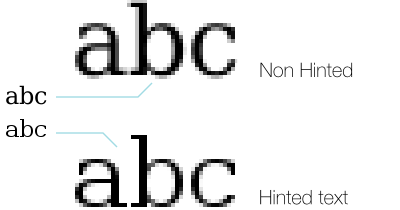
Fonts are special types of monochromatic vector paths that can have special hints to cater to pixel scalable issues. It does that via 2 methods
- Font hinting (also known as instructing) is the use of mathematical instructions to adjust the font’s visual appearance so that it lines up with a virtual grid.
- Font Kerning is moving the glyph on the relative x direction to achieve a more pleasing visual result and sometimes to help with the grid alignment issues…
All of this magic is done by your local font render engine and the extent to how much these operations are done depends on your local font rendering definitions…
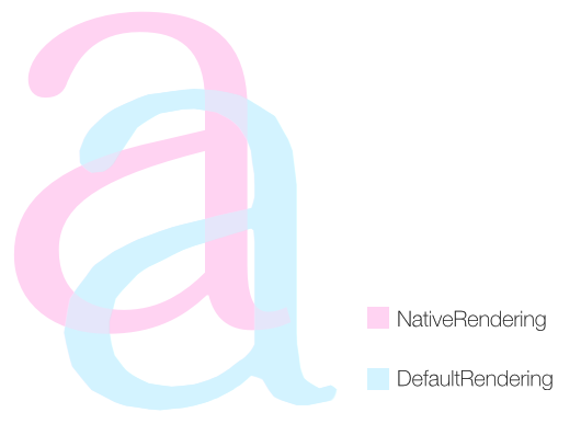
Now, since the introduction of QML 2, the way fonts are rendered has changed, and, by default font hinting is ignored. As a result, if you zoom into a font by animating the pixel size you get a nice smooth zoom effect, but slightly more blurry all around fonts, since they are not hinted.
QML does allow you to have native looking fonts by doing
Text {
    text: "Native here!"
    renderType: Text.NativeRendering
}
How ever if you try to do a zoom effect here, via animating the pixel size, you will have a “jumpy” text feeling because, as the size increases, the hinting instructions of the font will keep on trying to adjust to an ever-changing pixel grid.
Also, the default method does a vector like scaling via the distance field method when changing the scale: property, where when using native rendering, you see the pixels of the 1:1 scale ratio being scaled.
Another side effect of the distance field method used by default is that if the scale/font.size is very large you start to see the inaccuracies of the method, and this is valid for any font size you pick, the method generates the distance field glyph from a small image based on the font and it’s not updated as you scale it.

Also if the font is not well formatted (glyph bounding box smaller than the glyph itself) it might clip the font in some border areas with weird visual results.
So, my advice here is: if you need readable text that you don’t want to do pinch to zoom or any other effect that changes the font size in an animated way, use the native render. If you want something dynamic then go for the default mode. Or, you can even try for a compromise solution where, when animating, you choose default and in the end turn native on. It’s mostly a matter of what you consider most important and more polished at the end of the day.
Also noteworthy is that on the higher DPI screens the hinting instructions lose a lot of their importance since the pixel size and respective sub-pixel antialiasing ‘grays’ become much smaller and relatively less important in relation to the font body. The same is true for non square pixels like many (but not all) AMOLED screens have.
Next!
Next post will return to the subject of making scalable X/Y independent elements that work well with DPI metrics…
By the way, we will be discussing this subjects at the training days of Qt Developer Days 2014 Berlin, if you are interested in this subjects Registration is here.
So see you soon, here on my next post or at DevDays.


